 css样式实践
最终实现这样一个效果:
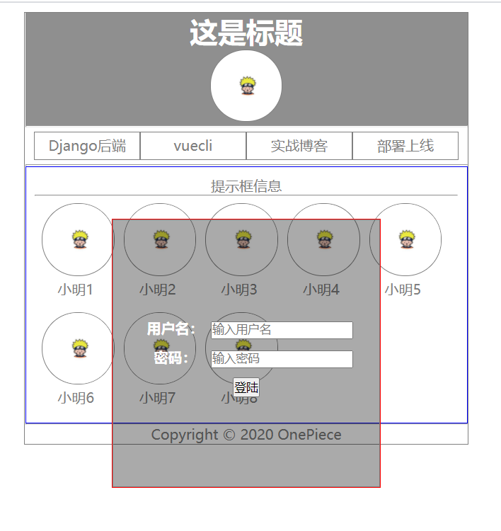
看到这图,首先,先完成下面的主体构造,再做登陆框.
<!DOCTYPE html>
<html lang="en">
<head>
    <meta charset="UTF-8">
    <meta name="viewport" content="width=device-width, initial-scale=1.0">
    <title>Bingo~</title>
    <link rel="stylesheet" href="./test.css">
</head>
<body>
    <div id="home">
        <!-- 头部 -->
        <div class="header">
            <h1>这是标题</h1>
            <img src="./1.jpg" alt="">
        </div>
        <hr >
        <!-- 主题内容 -->
        <div class="content">
            <!-- 导航栏 -->
            <div class="menu">
                <div class="item">Django后端</div>
                <div class="item">vuecli</div>
                <div class="item">实战博客</div>
                <div class="item">部署上线</div>
            </div>
            <hr>
            <!-- 用户列表 -->
            <div class="userlist">
                <!-- 提示框信息 -->
                <p>提示框信息</p>
                <hr>
                <div class="user">
                    <img src="./1.jpg" alt="">
                    <p>小明1</p>
                </div>
                <div class="user">
                    <img src="./1.jpg" alt="">
                    <p>小明2</p>
                </div>
                <div class="user">
                    <img src="./1.jpg" alt="">
                    <p>小明3</p>
                </div>
                <div class="user">
                    <img src="./1.jpg" alt="">
                    <p>小明4</p>
                </div>
                <div class="user">
                    <img src="./1.jpg" alt="">
                    <p>小明5</p>
                </div>
                <div class="user">
                    <img src="./1.jpg" alt="">
                    <p>小明6</p>
                </div>
                <div class="user">
                    <img src="./1.jpg" alt="">
                    <p>小明7</p>
                </div>
                <div class="user">
                    <img src="./1.jpg" alt="">
                    <p>小明8</p>
                </div>
            </div>
        </div>
        <hr >
        <!-- 尾部版权信息 -->
        <div class="foot">
            Copyright © 2020 OnePiece
        </div>

        <!-- 添加一个登陆框 -->
        <div id="login">
            <div id="loginbox">
                <div class="form">
                    <div class="item">
                        <div class="span">用户名:</div>
                        <input v-model="username" type="text" placeholder="输入用户名" />
                    </div>
                    <div class="item">
                        <div class="span">密码:</div>
                        <input v-model="password" type="text" placeholder="输入密码" />
                    </div>
                    <button @click="tologin">登陆</button>
                </div>
            </div>
        </div>
    </div>
</body>
</html>
2
3
4
5
6
7
8
9
10
11
12
13
14
15
16
17
18
19
20
21
22
23
24
25
26
27
28
29
30
31
32
33
34
35
36
37
38
39
40
41
42
43
44
45
46
47
48
49
50
51
52
53
54
55
56
57
58
59
60
61
62
63
64
65
66
67
68
69
70
71
72
73
74
75
76
77
78
79
80
81
82
83
84
85
86
87
88
89
90
主体构造:
划分为3个部分 一个大盒子包裹头部、中部、尾部.
头部一个h1标签和一个img标签;
中部导航栏,四个div标签;中部用户信息 p标签写提示信息、每个用户都用个div标签;
尾部版权信息.
注意:
1> 先给最外层盒子一个宽度,外边框、居中、里面元素居中、字体颜色,设置图片样式背景颜色啥的都是基本操作.
2> 这里导航栏的每一个内容都是div块状元素, 使用到了弹性布局, 再将里面的文字垂直居中, 内外边距啥的怎么好看怎么设置.
3> 而用户列表那, 用到了浮动, 秉承这样的思想: 浮动的元素先不管, 不浮动的先按照标准流排列, 然后浮动的元素.
假比它向左浮动, 左边碰到包含框(父级盒子)边缘或者另一个浮动的框边缘停止, 上方遇到标准流中的div也会停在其下方.
4> 而浮动元素太多导致的元素溢出, 可以用float:left 或者 overflow: auto;来解决.
通常需要设置一个最小高度宽度保证没有数据的时候,有个主体框架。
*{
  margin: 0;
  padding: 0;
}

#home{
  /* 设置盒子的宽度 高度会根据内容自适应可以不用设置 */
  width: 500px;
  border: 1px solid gray;
  /* 盒子居中 #home是最外层的盒子 那它外层是html元素 */
  /* 此盒子水平居中 上下外边边距10px(因为盒子内部填充的内容不够高 所以只有上外边距起效) auto自动计算左右距离平均分配 */
  margin: 10px auto;
  /* 将盒子里的所有文字图片都居中展示 */
  text-align: center;
  color: gray;
}

/* 盒子里的 所有img标签 */
#home img{
    width: 80px;
    height: 80px;
    border: 1px solid gray;
    border-radius: 40px;
}

#home .header{
  background: #00000070;
}

#home .header h1{
  color: white;
}

#home .content .menu{
    /* 弹性布局 这里默认里面的盒子水平从左到右排列
  原本这些div盒子都是块状元素 独占一行的*/
  display: flex;
  /* 内边距 */
  padding: 5px 10px;
  /* border: 1px solid gray; */
}

#home .content .menu .item{
  width: 25%;
  height: 30px;
  border: 1px solid gray;
  /* 文字垂直居中 设置值line-height=height */
  line-height: 30px;
}

#home .content .userlist{
  /* 这里userlist盒子里的元素浮动元素过多 导致元素溢出
   可以用float:left 或者 overflow: auto;来解决*/
  float: left;
  /* overflow: auto; */
  min-width: 400px;
  min-height: 100px;
  border: 1px solid blue;
  padding: 10px;
}

#home .content .userlist .user{
  /* 浮动的元素先不管 不浮动的先按照标准流排列
  然后浮动的元素 假比它向左浮动 左边碰到包含框(父级盒子)边缘或者另一个浮动的框边缘停止
  上方遇到标准流中的div也会停在下方*/
    float: left;
  width: 16%;
  margin: 8px;
}
2
3
4
5
6
7
8
9
10
11
12
13
14
15
16
17
18
19
20
21
22
23
24
25
26
27
28
29
30
31
32
33
34
35
36
37
38
39
40
41
42
43
44
45
46
47
48
49
50
51
52
53
54
55
56
57
58
59
60
61
62
63
64
65
66
67
68
69
登陆框:
登陆框一看就需要将其定位, 此次使用的是absolute, 因为没有其它元素使用定位, 所以是相当于html元素定位的.
而盒子里面的元素使用弹性布局, 需要在其父级元素设置.
/* ################################################ */

#login {
  position: absolute;
  border: 1px solid red;
  top: 50%;
  left: 50%;
  -webkit-transform: translate(-50%, -50%);
  transform: translate(-50%, -50%);
}

#loginbox{
  width: 300px;
  height: 300px;
  border: 1px solid grey;
  margin: 0 auto;
  background: #00000055;
  color: #fff;

  display: flex;
  justify-content: center;
  align-items: center;
}

#loginbox .form .item {
  font-weight: 700;
  margin: 10px auto;
}

#loginbox .form .item .span {
  /* 将用户名和密码左浮动 而input标签是行内元素 所以会跟在后面*/
  float: left;
  width: 80px;
}
2
3
4
5
6
7
8
9
10
11
12
13
14
15
16
17
18
19
20
21
22
23
24
25
26
27
28
29
30
31
32
33
34
当然可以给login设置个宽高,使用弹性布局来定位
#login {
  position: absolute;
  top: 0;
  width: 700px;
  height: 100vh;
  display: flex;
  /* 水平居中 */
  justify-content: center;
  /* 垂直居中 */
  align-items: center;
  /* border: 1px solid red; */
}
2
3
4
5
6
7
8
9
10
11
12
哦, 还有重要的一点, 用户名密码那, 使用了一个float, 看到的现象是块状元素和行内元素一起, 块状元素浮动, 行内元素不会被覆盖会跟在后面; 其实这样不好, 通常是一起浮动, 或者在其父级元素使用display:flex!!
单独探究下 display 布局设置!!

<!DOCTYPE html>
<html>

<head>
  <meta charset="utf-8">
  <title></title>
  <style type="text/css">
    .content {
      width: 300px;
      height: 200px;
      border: 1px solid gray;

      /* flex要为父级元素来设置 里面的儿子div会自动变为行内块的排列 */
      /* 里面的东西用一个盒子装起来 然后将其居中
      他会自动调节这个盒子与最外层盒子上下左右的距离*/
      display: flex;
      justify-content: center;
      align-items: center;
    }

    /* display:block 块级元素 */

    #box{
      display: flex;
    }

    /* 每个盒子都是其内容的尺寸 注意无法人工指定宽度
    因为显示为内联后 宽度由内容来决定*/
    /* 如果想要一个固定的宽度 就设置为inline-block */
    /* #box .span{
      display: inline;
    } */

    /* 父级盒子使用flex 里层的盒子用margin:auto可以弹性布局
    其实等效于里层的盒子使用display: inline-block; 只不过不能弹性布局罢了 */
    #box3{
      display: flex;
      /* background: red; */
      border:1px solid red;
    }

    #box3 .ff{
      /* display: inline-block; */
      margin: auto;
      border:1px solid red;
    }
</style>
</head>

<body>
  <div class="content">
    <div id="from" style="border: 1px solid gray;">
      <div id="box">
        <div class="span">用户名:</div>
        <input type="text" placeholder="输入用户名" />
      </div>
      <div id="box">
        <div class="span">密码:</div>
        <input type="text" placeholder="输入用户名" />
      </div>
      <div id="box3">
        <div class="ff">
          <div>aaa</div>
          <div>bbb</div>
        </div>
        <div class="ff">b</div>
        <div class="ff">c</div>
        <div class="ff">d</div>
      </div>
    </div>

  </div>

</body>

</html>
2
3
4
5
6
7
8
9
10
11
12
13
14
15
16
17
18
19
20
21
22
23
24
25
26
27
28
29
30
31
32
33
34
35
36
37
38
39
40
41
42
43
44
45
46
47
48
49
50
51
52
53
54
55
56
57
58
59
60
61
62
63
64
65
66
67
68
69
70
71
72
73
74
75
76